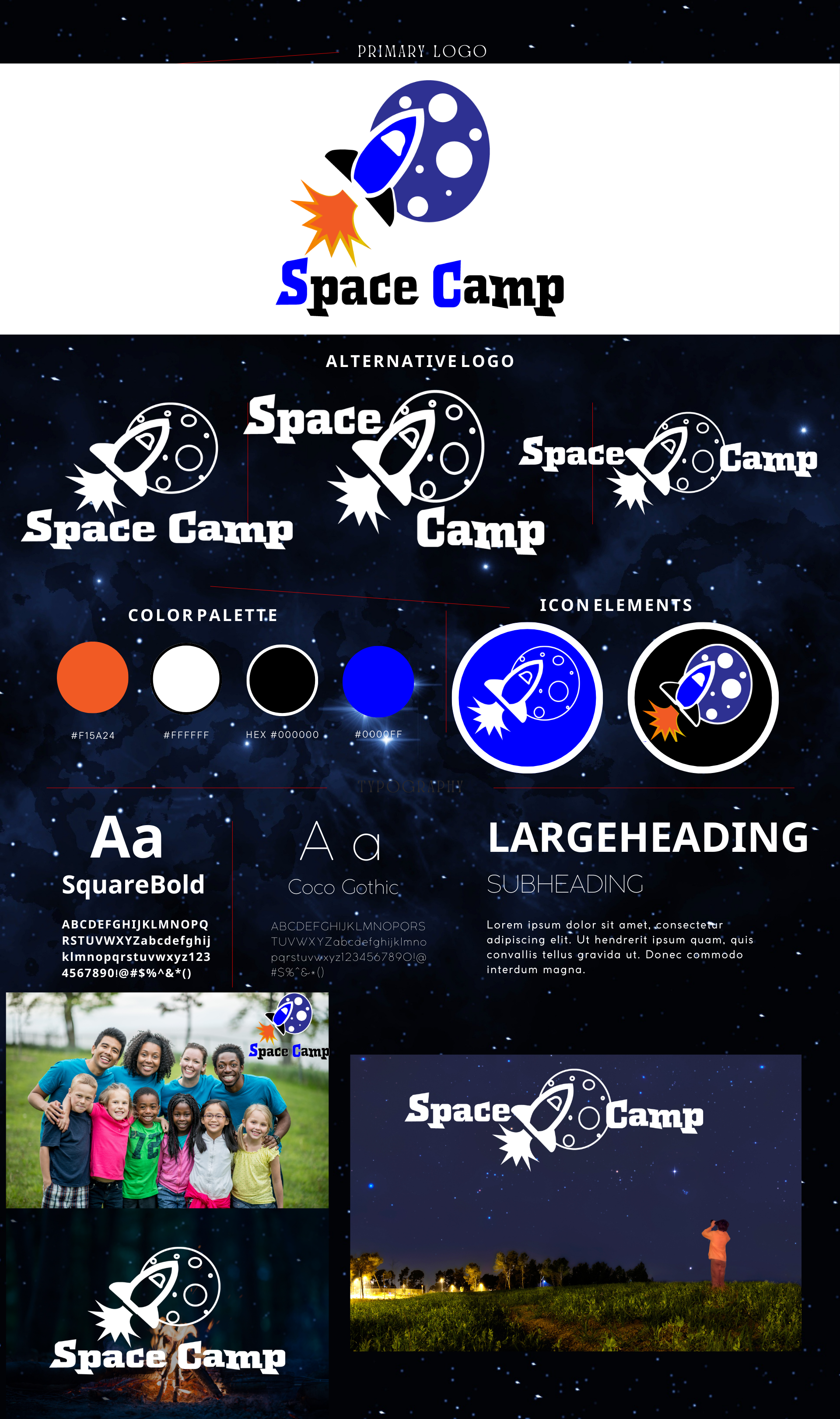
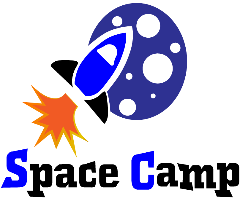
Primary Logo Design
Logo Brief
Greetings and welcome to my logo design expedition. Today, I am embarking on a journey to redesign the logo for Space Camp, a captivating summer camp tailored for children with an insatiable curiosity for space. The objective is to seamlessly blend entertainment and education within a vibrant and engaging environment.
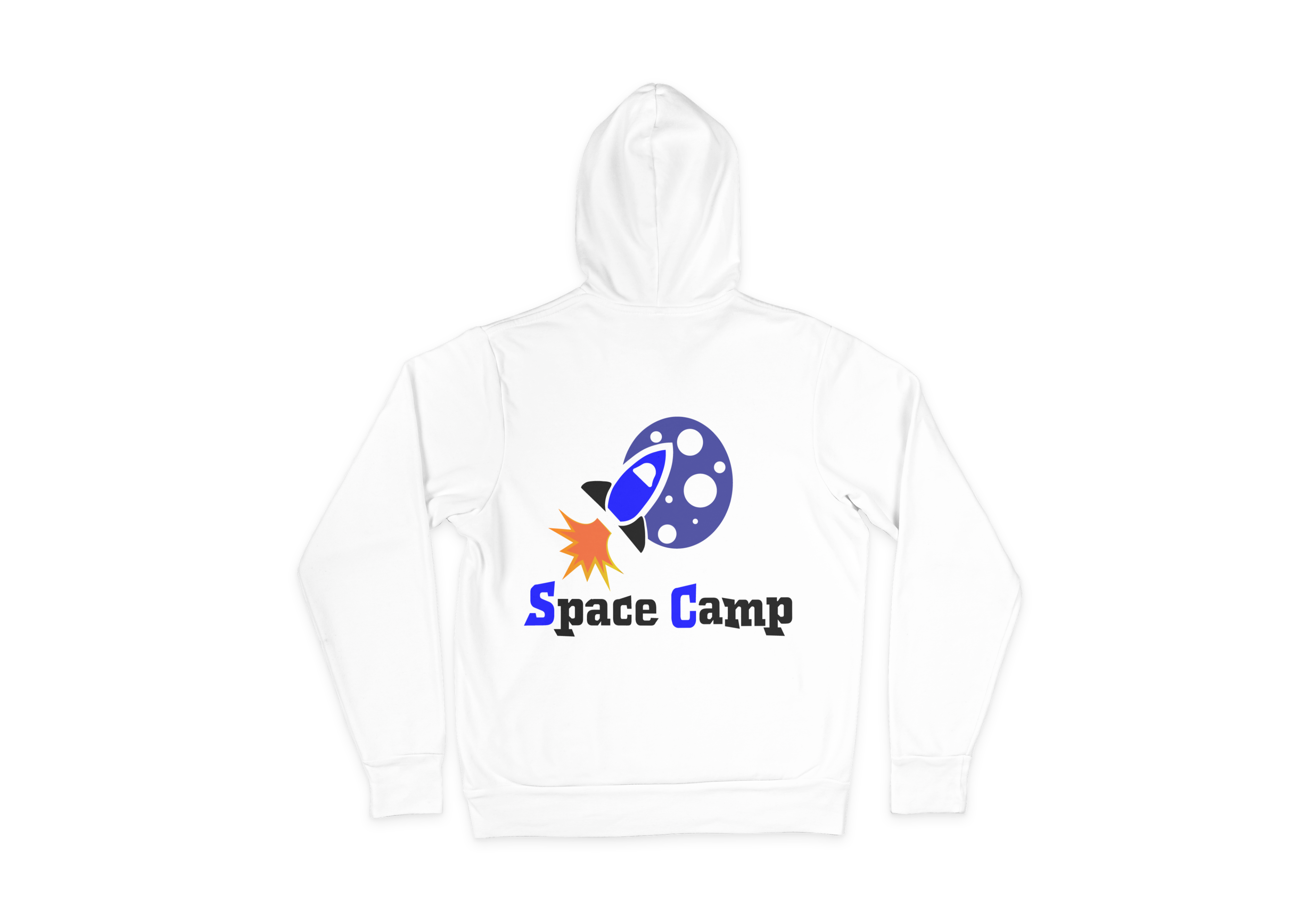
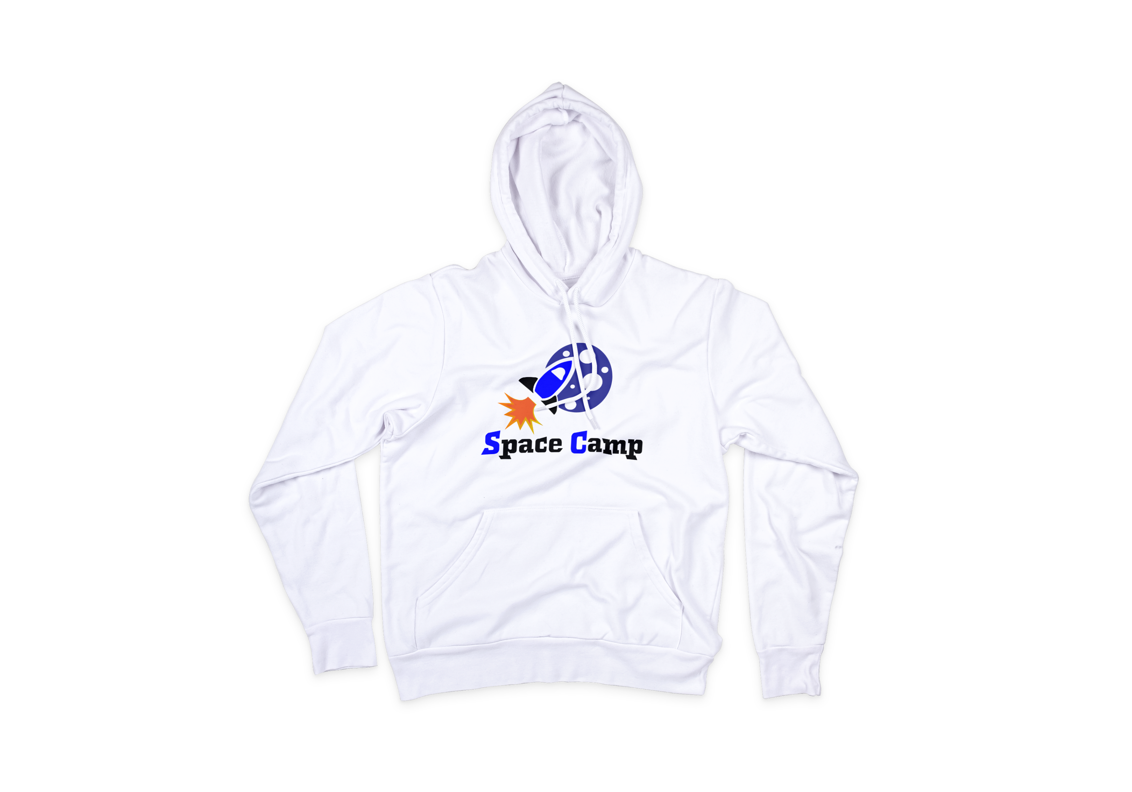
My logo design concepts are meticulously crafted to captivate the imaginations of young minds and effectively communicate the essence of the brand. By incorporating a crescent moon and a rocket ship, the logo embodies the boundless love for space and conveys the exciting adventures awaiting the campers.
Extensive research has been conducted to ensure a well-rounded approach. Inspired by the mesmerizing hues of the cosmos, I have introduced a color palette consisting of blues, blacks, and reds. These colors infuse the design with a sense of vibrancy and playfulness, effectively enhancing the overall visual experience.
By intertwining creativity and knowledge, the revamped logo aims to evoke a sense of wonder and ignite the passion for space exploration in every child who encounters it. This logo design is a testament to the commitment of Space Camp in fostering an environment where learning becomes an exhilarating and immersive adventure.
Join me on this celestial expedition as we embark on an exciting journey into the depths of space through captivating design!
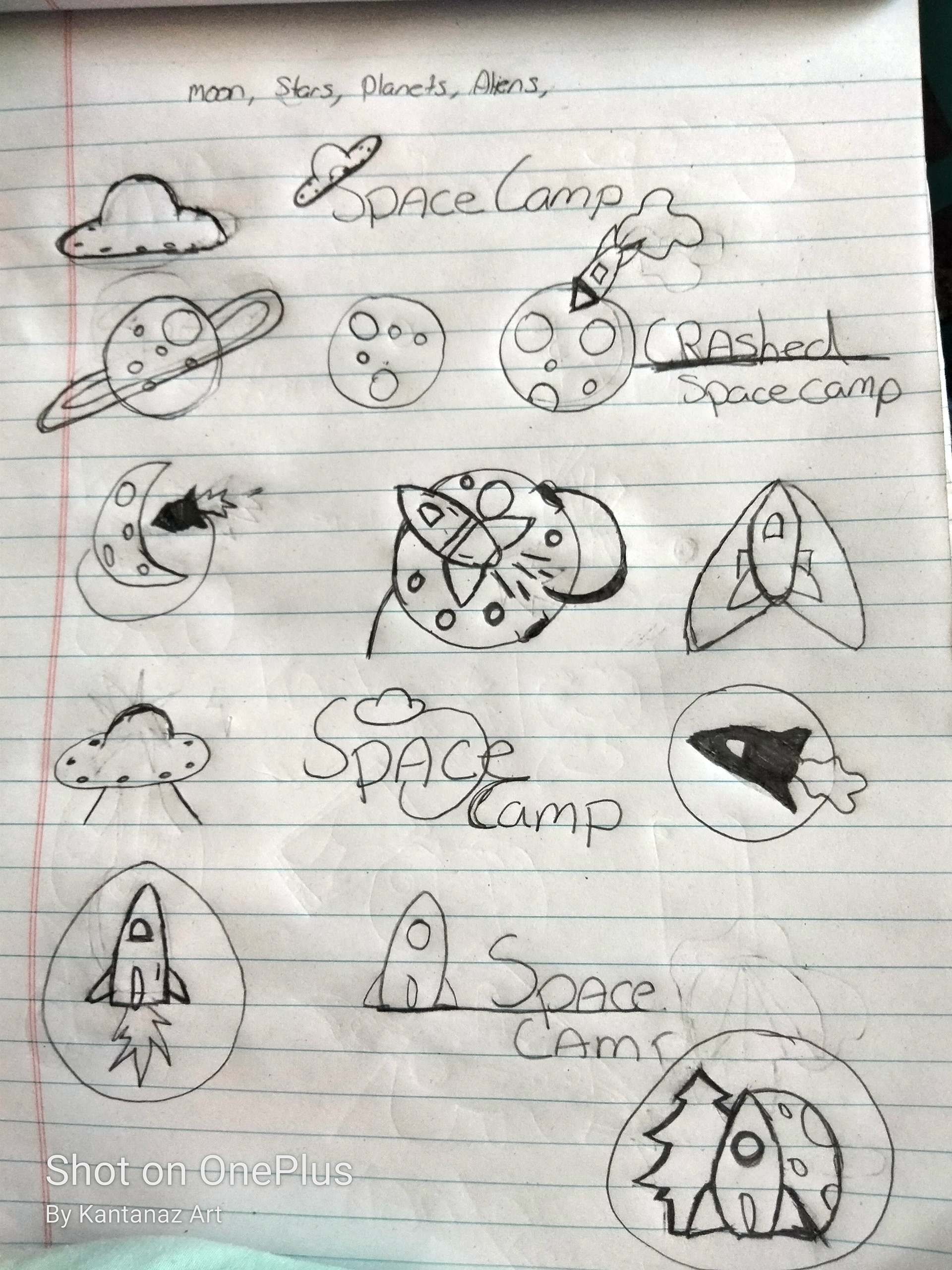
Design Sketching
My very first steps are to sketch out designs and choose one by importing and playing around with elements.
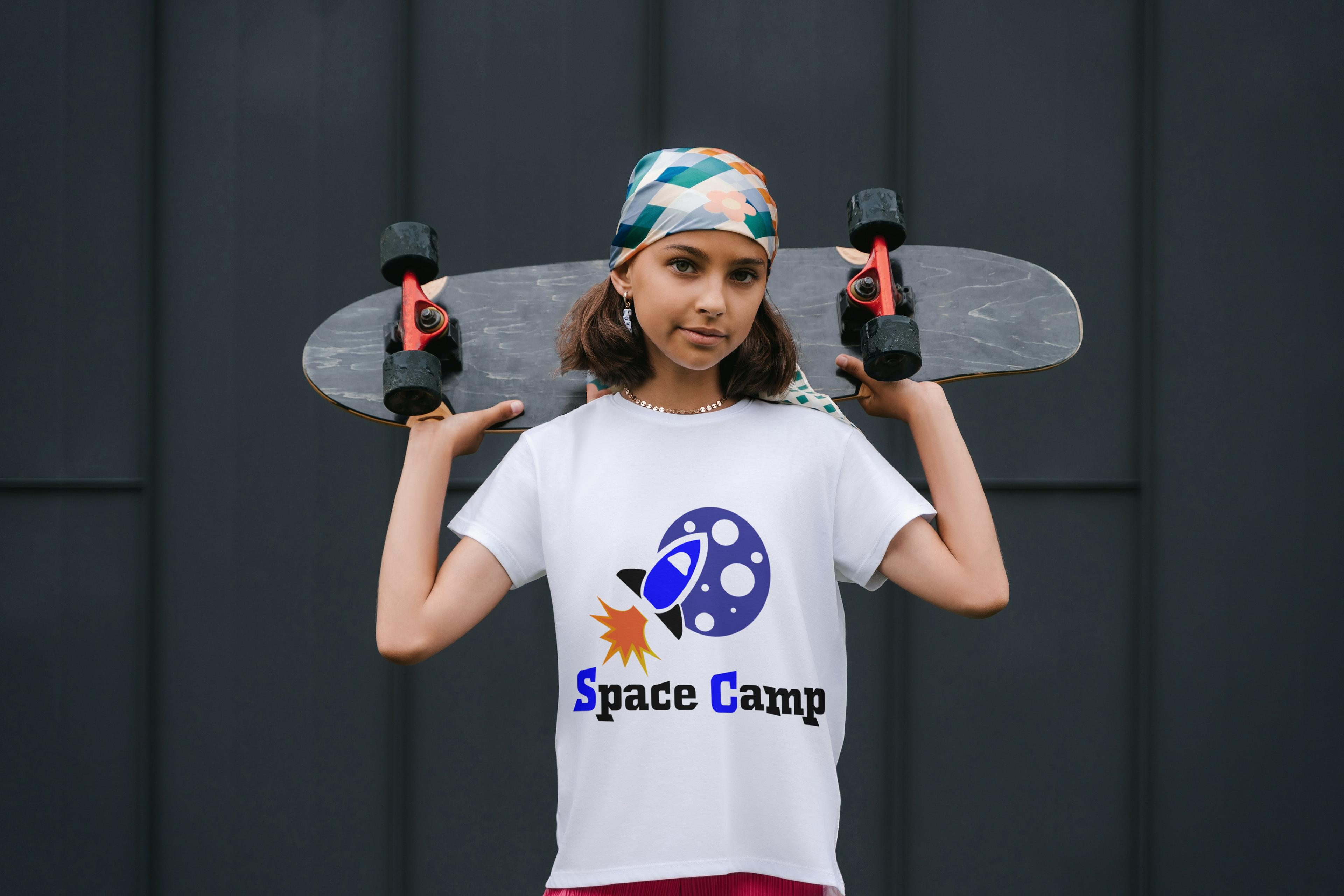
Alternate Logo Designs
Other designs that can be used with the same logo but in different positions

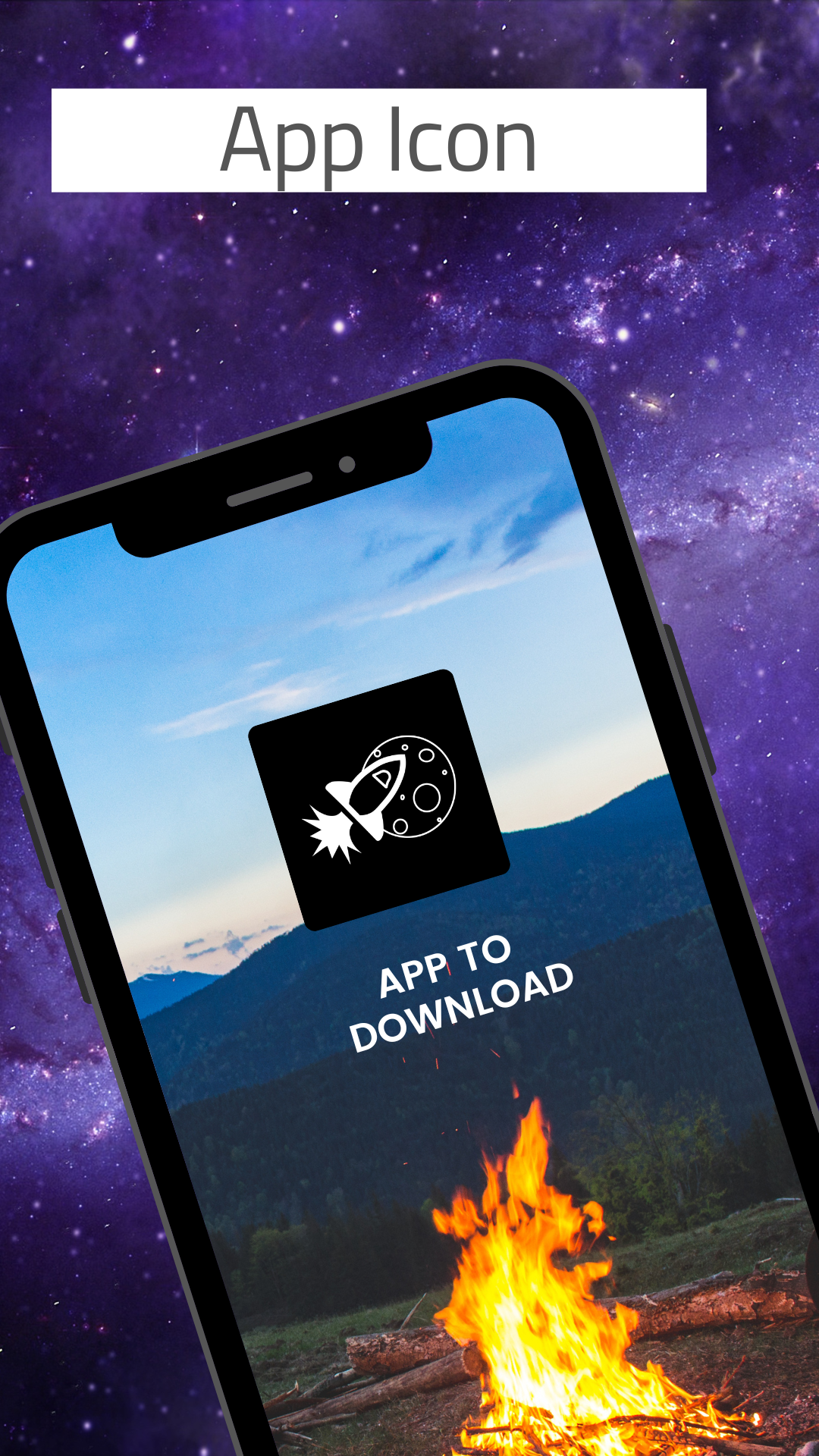
Icon Design